Brand Collateral to Download and Use
Remember that anything you see in the Brand Guidelines are available to you as both Illustrator files and (with only a few exceptions) Canva files. A quick link to bookmark for all collateral is https://oneja.org/brand-collateral.
These files go way beyond lockups. We have templates for reports, social-media content, posters, letterhead, and so much more. Files are hyperlinked in the JA Brand Guidelines and sorted by folders on Dropbox.
Talk to Us
Having any issues with your lockups or other collateral, like a typo in the Brand Guidelines, odd sizing, missing files, links that don’t work, or anything else? Want to share your love for the brand? No matter what you want to discuss, be in touch by completing the form below.
JA Brand Guidelines
We’ve created a fully translatable version of the 2025 Brand Guidelines. To translate, choose your language from the menu on the lower-right of this page. You can also:
View the JA Worldwide Style Guide. This is meant to be a helpful tool if you’re building or updating a style guide of your own, but using this guide is not required. Of particular interest to the network has been the fourth section, “Language and Usage.”
Jump to Logo | Signage | Color | Accessibility | Type | Photos | Icons | Graphics | Messaging | Sub-Brands | Collateral
LOGO
OUR STORY
From the original Junior Achievement logos (launched in 1919 and 1941), which used wings as their visual symbol, came the idea of flying, excelling, having the means to soar.
Yet our students do not stand alone, but impact those around them, sharing their newly acquired skillset and confident mindset. Just imagine if every JA student created jobs for just five others! Youth unemployment would soon be a thing of the past.
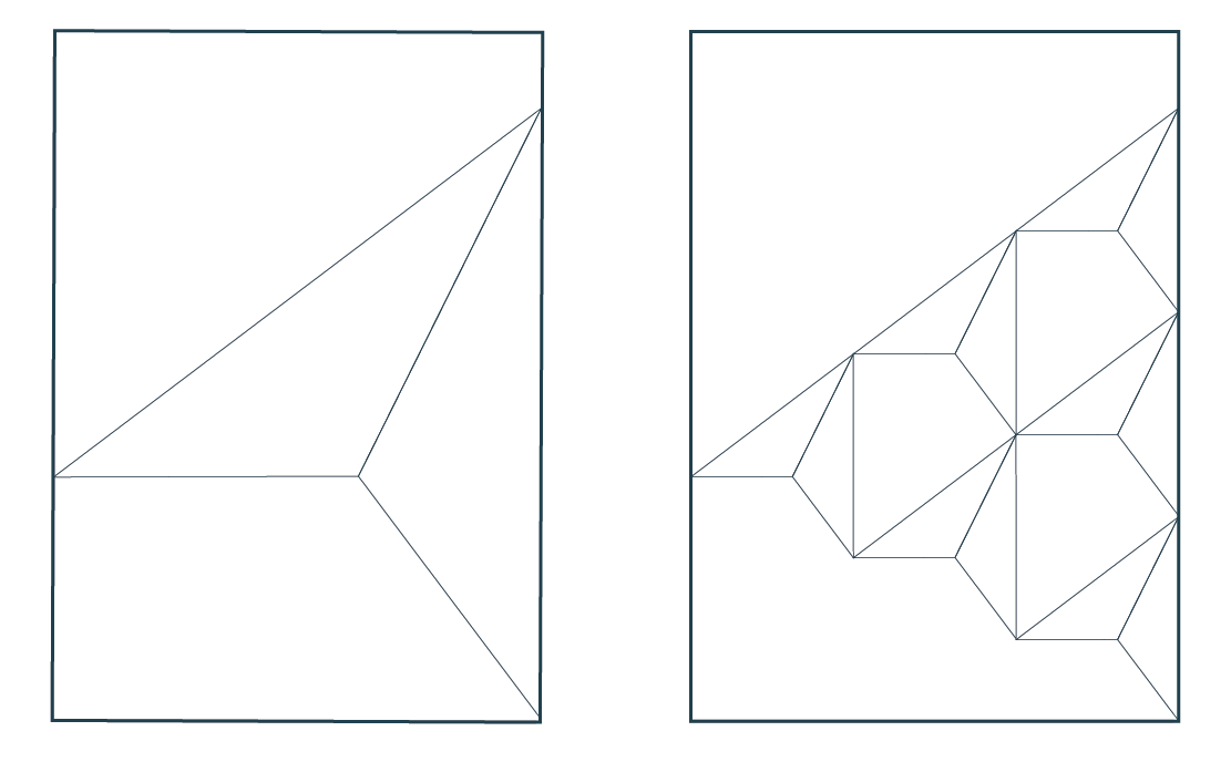
For this reason, we started with JA’s original soaring bird (from 1919 and 1941), and turned it into a flock of six (the JA student + five others impacted by that student). We then brought in similar lines and angles from the JA symbol that launched in 1967, reintroduced the kite logo (launched in 1955) via the negative (white) space of our new symbol, and kept a strong correlation with our longest-running symbol, launched in 1986.
JA’s brand symbol honors our long and impactful history while moving us into the future.
EVOLUTION OF THE JA SYMBOL
MODERNIZED JA SYMBOL
SYMBOL: FULL COLOR
The full-color symbol on a white background is a striking image.
FIXED: Use this symbol only on white or on the colors shown on the next page. When overlapping other colors, use the colors other than white or the four shown on the next page, use the monochrome version in this section. Also see notes in the “Signage” section about the alignment of the points in the symbol.
Make this symbol your website favicon and your social-media profile picture (both ready for you as downloads).
FLEXIBLE: Temporarily replace your social-media profile pictures with event- or campaign-specific images, as desired, reverting back to this design at the end of the campaign.
SYMBOL: ADDITIONAL COLOR OPTIONS
Here are examples of the symbol placed on four JA colors: Boundless Blue, Resilient Turquoise, Yellow Inspiration and Immersive Blue-Black.
Fixed: You can create any combination using the JA color palette; however, do not use Real-World Red in our symbol.
SYMBOL: MONOCHROME
When our monochrome symbol, the right half of each bird remains a solid color, while the left side is 50% translucent, using the same color.
FIXED: The colors on the left side of each bird should be only a 50% transparency.
FLEXIBLE/FREESTYLE: The symbol can take any color from our color palette and go over any color from the color palette, as long as there’s enough contrast, and as long as the one-color-from-the-primary-color-palette requirement is met, above.
When the symbol is used as part of a design, the birds can take on multiple colors. See the “Collateral” section for examples.
ONE-COLOR SYMBOL
The JA one-color symbol adds a modern touch to your designs, but loses our symbol’s 3D quality. In addition, the white space between the JA birds looks a bit like a nuclear power sign. Use sparingly.
SYMBOL AS ART
This design can be used to create 3D sculptures or art to decorate a space. It may, one or more of the birds may be used as a graphic element in any of your designs
FULL-COLOR LOCKUPS
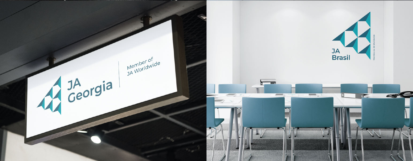
Our global symbol, combined with the name of each organization (and, for regional operating centers and member locations, “A Member of JA Worldwide”), creates a consistent global identity.
FIXED: These lockups have been created for you and is fixed. The version shown here is for a white background. Also see note in the “Signage” section about the alignment of the points in the symbol.
MONOCHROME LOCKUPS
When the symbol becomes monochrome, the right half of each bird remains a solid color, while the left side becomes 50% transparent with the same color.
FLEXIBLE/FREESTYLE: The symbol can take any color from our color palette and go over any color from the color palette, as long as there’s enough contrast.
SPACING AROUND OUR LOCKUP
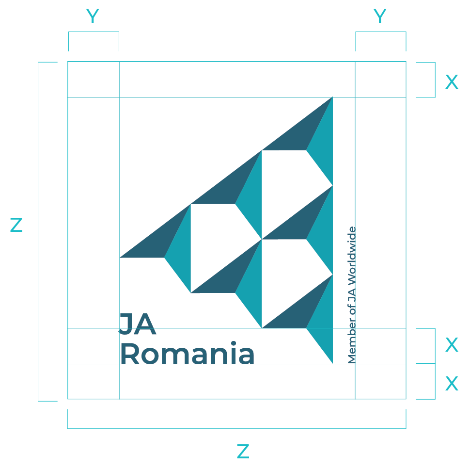
FIXED: While the size of the panel may vary, free space around the lockup is fixed. In cases of rectangular formats the free space equals the height of one bird. For a square format, top and bottom space equals X and left and right spaces equal Y: see the example shown below.
SIGNAGE
INTRODUCTION
Signage is a vital part of brand identity, both internal and external. Some JA locations own large buildings that require equally large signage. Others are located in small workspaces that will require only a sticker on a door. Still other offices are fulltime work-from home. No matter what your circumstance, you’ll find advice and examples in this section.
NOTE: We made a mistake early in the rebranding process: The symbol that has been used in the lockups and in most of the examples is not perfectly aligned when used at 500% and above. This means that, when the symbol is quite large (as on signage), the points will not align. Thanks to Junior Achievement USA locations that recognized (and fixed) this, you can download a perfectly aligned symbol to use in signage.
COLOR
MUTED/MEDIUM TONES
RESILIENT TURQUOISE
CMYK 79, 17, 30, 0
RGB 0, 160, 175
HEX #00A0AF
PANTONE 7710 C
STARTUP JADE
CMYK 71, 5, 69, 0
RGB 70, 177, 123
HEX #46B17B
PANTONE 7480 C
TRANSFORMING TEAL
CMYK 84, 29, 34, 2
RGB 0, 139, 156
HEX #008B9C
PANTONE 7711 C
GLOBAL GREEN
CMYK 86, 16, 100, 4
RGB 0, 148, 36
HEX #009424
PANTONE 7482 C
ADAPTABLE AZURE
CMYK 85, 47, 32, 7
RGB 40, 112, 139
HEX #28708B
PANTONE 7468 C
SUSTAINABLE FOREST
CMYK 90, 29, 99, 17
RGB 0, 118, 61
HEX #00763D
PANTONE 7726 C
BOUNDLESS BLUE
CMYK 87, 54, 40, 17
RGB 40, 95, 116
HEX #285F74
PANTONE 7707 C
BRIGHT/INTENSE COLORS
ENTERPRISE AQUA
CMYK 71, 0, 24, 0
RGB 0, 192, 202
HEX #00C0CA
PANTONE 7466 C
GRITTY GREEN
CMYK 31, 2, 86, 0
RGB 187, 209, 83
HEX #BBD153
PANTONE 382 C
EMPOWERED YELLOW
CMYK 15, 1, 83, 0
RGB 227, 226, 79
HEX #E3E24F
PANTONE 388 C
LEADERSHIP LIME
CMYK 49, 2, 99, 0
RGB 143, 196, 64
HEX #8FC440
PANTONE 368 C
SOFT HUES
OPTIMISTIC ICE
CMYK 22, 0, 7, 0
RGB 194, 237, 240
HEX #C2EDF0
PANTONE 628 C
POSSIBILITY PEARL
CMYK 5, 2, 2, 0
RGB 238, 243, 244
HEX #EEF3F4
PANTONE N/A
REACH FOR THE SKY BLUE
CMYK 38, 0, 13, 0
RGB 153, 217, 223
HEX #99D9DF
PANTONE 3105 C
CONFIDENT CREAM
CMYK 5, 0, 37, 0
RGB 243, 242, 179
HEX #F3F2B3
PANTONE 0131 C
DARK TONE/TEXT
POP OF COLOR (USE SPARINGLY AND ONLY FOR CONTRAST)
IMMERSIVE BLUE-BLACK
CMYK 87, 64, 51, 41
RGB 34, 64, 77
HEX #22404D
PANTONE 7477 C
REAL-WORLD RED
CMYK 0, 78, 70, 0
RGB 246, 95, 78
HEX #F65F4E
PANTONE N/A
GRADIENTS
Gradients add variety to your designs while reinforcing our global identity. Five are shown here, but by combining our brand colors, you can create 250 two-color gradients and even more three- or four-color gradients!
RESILIENT TURQUOISE–EMPOWERED YELLOW
GRITTY GREEN–PALE BLUE
BOUNDLESS BLUE–EMPOWERED YELLOW
IMMERSIVE BLACK BLUE–RESILIENT TURQUOISE
TEAL BLUE–OPTIMISTIC ICE
FLEXIBLE/FREESTYLE: Make your own two-color or three-color gradients from any of the 16 colors of our color palette. You may, on rare occasions, use Real-World Red in a gradient, but be sure it is rare!
ACCESSIBILITY
An accessible website, online presentation, or live event is one that can be accessed by all visitors, taking into account their differing capabilities. Inaccessible content poses significant barriers to people with disabilities.
Besides alienating students, alumni, volunteers, partners, funders, and donors, inaccessible content may result in a fine—or even a lawsuit—in some localities.
A FEW BASICS
Designing for accessibility can be best summed up through the four areas shown below.
COLOR CONTRAST
Color contrast (scroll below for details) is the difference in brightness between foreground colors (say, the color of text or a button) and background colors. “High contrast” (lots of difference in brightness) ensures that people with moderately low vision can distinguish between the colors and see your content. “Low contrast” means that the difference in brightness is quite low; that is, the colors are too much alike, are not easily viewed by someone with vision impairment, and leads to inaccessible content.
CROWDING/OVERLAPPING
Including plenty of “white space” (the area of a design that does not have images or text) is a tenant of good design, but it is especially important when designing for accessibility. Be sure to allow plenty of blank space around text, images, buttons, and more, especially on mobile and other small devices. Avoid having your text overlap with other text. This is especially important when using our brand textures and patterns.
ALT TEXT
When you upload an image or graphic to a digital space (website, social media, etc), you’re often given the option to describe that image or graphic in words as “alt text.” In this way, visually impaired users can still understand that a photo shows, for example, “JA student chatting with the CEO of XYZ Corporation while in a meeting with other XYZ executives.”
It’s really that simple: You describe the photo or image in words. It takes a bit of extra time but ensures that your photos are accessible.
ILLEGIBLE TEXT
Text tends to be illegible (that is, not readlabe) for two reasons: Because it is too small, and because the font itself is so fancy that it becomes unreadable. Stick to basic fonts like Montserrat and Work Sans on your website, and be sure they are at least 14pt (when bold) or 18pt (when not bold).
Very large text can be as difficult to read as small text, especially if the large text is hyphenated at odd places. Hyphenate sparingly and only between syllables.
COLOR CONTRAST
Use this guide to ensure that your graphics and images are accessible to people with vision impairment, Accessible designs feature a great deal of contrast between font/button/icon colors and background colors.
In the chart below, rectangles represent background colors, while circles represent text/button/icon colors that sit on top of that background color:
If a circle is blank, that color works well on the background color shown.
If you see an asterisk, the combination works only when the font is quite large (18pt or larger) or both bold and large (14pt or larger)
When you see an X, do not use this combination of text and background color.colors.
TYPE
Montserrat, a Google font that mixes both contemporary and classic features, unites our global identity. The Montserrat type family, which works with both Latin and Cyrillic alphabets, contains a wide range of weights, from Black to Thin.
FIXED: Montserrat is the only font for our lockup and for all levels of headings in digital graphics, in print, on PowerPoints, and on websites.
FLEXIBLE/FREESTYLE: Montserrat may be difficult to read or too busy in body copy, especially on websites and in apps. We provide Work Sans as alternative. On web platforms that have a limited font selection, we suggested Roboto as an alternative.
FLEXIBLE/FREESTYLE: Here’s a sample proportional typographic hierarchy. Extra Bold is used for large headings; Semibold for subheadings, intro paragraphs, and large quotes; Regular or Medium for body copy, but in your choice of Montserrat or Work Sans.
The larger your type, the tighter the leading (space between lines) should be.
Most designs and websites benefit from no more than three of four font sizes.
Size: 10X
Font: Montserrat
Weight: ExtraBold
Leading: Same as type size
Use: Main Heading
Size: 5X
Font: Montserrat
Weight: SemiBold
Leading: Same as type size
Use: Subheading
Size: 2.5X
Font: Montserrat
Weight: SemiBold
Leading: Auto
Use: Intro paragraph or a large quote
Size: 1X
Font: Work Sans
Weight: Regular
Leading: Auto
Use: Body copy
Ideally, you’ll use Montserrat for all your body copy. However, Montserrat can look rather large, even when a small type size is used on your website or in publications. In these cases, you may use Work Sans as an alternative. In graphics, use Montserrat as your body copy.
Work Sans family
JA TEXTURE FONTS
JA Texture is a special fonts, made just for JA, based on Montserrat and employing an urban, textured look. Each letter and number has an alternate to create more natural, less unified feel to the graphic. Download the font to your computer and use it as you would any other font. But note: You cannot change the color of this font. You must download the font premade in the color you wish to use.
JA Texture Blue-Black
JA Texture Turquoise
JA Texture White
JA YOUTH FONTS
JA Youth and JA Youth Multicolor are special fonts, made just for JA, based on Montserrat, but rounding the corners to make them youth-friendly. In the multicolor version, each letter and number has three alternates to give you a variety of colors. Download the fonts to your computer and use them as you would any other font. You can change the color of JA Youth, but the font color cannot be changed in JA Youth Multicolor.
JA Youth
JA Youth Multicolor
JA MULTICOLOR FONT
JA Multicolor is a special font, made just for JA, based on Montserrat, with the combination of color similar to what we used during the JA Centennial. Download this font to your computer and use it for all-caps, in the colors specified. Note that each letter and number has one alternate to give you some variety. There are no lowercase letters.
JA Multicolor
JA OUTLINE FONT
JA Outline is a special font, made just for JA, based on Montserrat, but showing only the outline of each letter. Download the font to your computer and use it as you would any other font. You can change color and size as you would with any typeface, but you'll be changing only the color of the outline. The inside of each letter is transparent, so it takes on the color behind it (in this case, white).
JA Outline
JA STENCIL FONT
JA Stencil is a unique JA font based on Montserrat and employing a stencil look. Download the font to your computer and use it as you would any other font!
JA Stencil
PHOTOS
CLOSE-UP PHOTOS
Photography showing young people is an important element of our global brand.
The first category of photos are close-ups that zoom in on facial expressions (concentration, surprise, confidence, joy, etc.), with the background either blurred or a solid color from the color palette.
FIXED: Be sure to obtain permission from all photography subjects and their parent/guardian before using photos.
FLEXIBLE/FREEYSTY;E: Photos are no longer required to include “Photo by [name of photographer or organization].” It has become both cumbersome and distracting in some situations. So, while we aim to credit photographers and JA locations as much as possible, it is not a fixed element of our brand.
ACTION PHOTOS
The second category of photos are action shots that exude real energy (jumping, laughing, dancing, reacting to good news, etc.). These photos may be used alone or interlaced into the symbol or into typography.
For all photos, ROCs and JA Worldwide are encouraged to also list a country of origin with the credit line.
GROUP PHOTOS
The third category of photos are group shots that communicate joy, camaraderie, diversity, and inclusion.
Whether taking photos or buying them, try to ensure that the photography on your website, in your social-media graphics, and in your reports reflects the diversity of your JA location, making a special effort to look for differences in age, ethnicity, disability, gender expression, and more.
DUO-TONE PHOTOS
All three categories of photos mentioned above can exist in two-tone format (also called “duotone”). We’ve made it easy to duotone your photos by providing eight different pre-sets. You must use Photoshop to use the instructions below, but you can be an absolute beginner: No experience required. Here’s how to create duotone photos in Photoshop.
Step 1: Open an image in Adobe Photoshop, and then click Image -> Mode -> Grayscale.
Step 2: Click Image -> Mode -> Duotone.
Step 3: In the dropdown menu under the gear symbol, choose Load Preset.
Step 4: Choose your preferred color preset from the Duotone Presets folder; for example, Aqua-Turquoise preset.
Step 5: Click OK.
Step 6: Convert the image into RGB mode by clicking Image -> Mode -> RGB.
You can also make duotones in Canva.
ICONS
Due to popular demand, we’re continuing to add JA branded icons, featuring an abstract, modern feel. In addition to the full-color set we launched with our modernized brand, we now offer light-color and dark-color versions:
Full color: Use on white or Possibility Pearl backgrounds
Light color: Use on dark backgrounds (such as Immersive Blue-Black, Boundless Blue, Adaptable Azure, Transforming Teal, or Sustainable Forest)
Dark color: Use on light backgrounds (such as Optimistic Ice, Reach for the Sky Blue, Confident Cream, or Empowered Yellow)
FIXED: Use the JA icons, not icons you’ve downloaded from other sources, as they are an important part of our brand identity. However, use icons in small contexts: showing options on a website, standing in for text on a graphic or chart, or adding to a concept in a PowerPoint. When you need something larger, opt for a photo instead.
FLEXIBLE/FREESTYLE: You may create additional icons, using the same solid-color scheme and look and feel you see here. Icons should be abstract, simple, and modern-feeling.
Full color: Boundless Blue, Enterprise Aqua, Empowered Yellow
Light color:
Dark color:
Access/accessibility
Air balloon
Air horn
Brain
Budget
Capacity
Capstone
Career exploration/work readiness
Choice/equity
Choice
Circular economy/continuous loop
Coaching
Confidence/star
Collaboration
Community
Creativity/paint palette
Creativity/pencils
Digital banking
Digital skills
Document
Donations/fundraising
Entrepreneurship
Files/folders
Files
Financial health
Financial literacy/dollar sign
Financial plan
Financial plan
Financial literacy/bank notes
Financial literacy/coins
Financial literacy/credit cards
Flame
Folders
Gear
Goal/summit/milestone
Gold medal
Government building
Graph
Growth
Home
Idea/light bulb
Image
Image
Images
Inclusion/community
Inclusion
Integrity/ethics/values
Leadership
Learning
Mentorship
Microphone/podcast/speech
Milestone
Mobile app
Mobile connection
Mobile learning
Mobile signal
Mobile transaction
Navigate
Opportunity
Organizational chart
Partnership
People/inclusion
People
Performance
Plug in/charge
Power/lightning bolt
Power
Presentation
Program/programming
Program/programming
Question
Research
Resilience
Resourcefulness
Savings/savings account
School
Self-efficacy
Share/sharing
Shopping cart
Skills/skillset
Skills/tools
Small business
Sparks
Speech/conversation
STEM skills
STEM skills
Students
Succsess/trophy
Sustainability/growth
Sustainable development
Target
Teacher
Teamwork
Teamwork
Time/hours
Tools
Urgent/urgency
Video/movie
Viewpoint
Volunteer/heart
Work readiness/career exploration
Youth development
Maple leaf/Canada
Accelerate digital
Airplane/travel
Analytics/metrics/survey results
Business to consumer
Business concept development
Checkmark
Credential/certificate
Digital divide
Diploma
Email
Experiment
Gift
Global/local footprint
Globe/global locations/global impact
Impact
Nano-entertainment
Pen and pencil
Passport
Quote marks
Raised hand
Research
Remote/hybrid school/work
Search/research
OneJA/JA student
Technology
Reach/connection
JA Brand
Facebook like
Facebook messenger
Facebook
Instagram like
Instagram
Call
LinkedIn
Telegram
Pintrest
Snapchat
Tik Tok
Twitter
Video
YouTube
More icons to come as you request them!
What Icons Do You Need?
Keeping in mind that our new branding puts large photos front and center—which means our brand icons should be used sparingly and kept to a fairly small size—which ones should we focus on? We currently offer about 100 icons, but are always looking to add more. After reviewing the existing icons (including 40 new ones for 2023), what additional topics and ideas would you like to see represented?
GRAPHICS
OUR SYMBOL AS A PATTERN
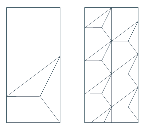
The birds in our symbol can become structures for your graphics. The structure is flexible and fits a variety of formats, including portrait and landscape as well as digital media. The bird can also form a pattern that can be used as a background or repeater.
A1, A2, A3, A4
US Letter
3-Fold Booklet A4
A1, A2, A3, A4
US Letter
DIGITAL
Tablet
Mobile
Desktop 16:9
PowerPoint 4:3
TEXTURES: UPDATED IN 2023
Using spray paint and rolled ink textures in your designs makes them stand out and demand attention.
If you’re using text with textures, be sure to follow the advice in the “Accessibility” section of these guidelines.
FLEXIBLE/FREESTYLE: We encourage you to purchase and download additional spray paint and/or rolled ink textures to use in your designs. Be sure to apply our brand colors to any textures you purchase.
PATTERNS
Use patterns to add richness to your graphics. You can also develop your own, and we encourage you to share any original patterns you create with the JA network.
If you’re using text with patterns, be sure to follow the advice in the “Accessibility” section of these guidelines.
FLEXIBLE/FREESTYLE: We encourage you to design additional patterns that incorporate the brand symbol and sharing them with the rest of the JA network.
SYMBOL WITH A PERSON
You can use these graphics on a website, poster, or any other marketing materials. To see examples of how these graphics are being used, see the “Collateral” section of these guidelines.
MESSAGING
VISION
When we look 20, 30, or more years in the future, what is our vision for the world’s youth? We envision a world in which young people have the skillset and mindset to build thriving communities.
Our work contributes to this vision, of course. But the vision is bigger than JA. We may never reach all two billion global youth, but by advocating for experiential learning in every school in the world, and by nurturing partnerships with schools and other like-minded organizations, we envision a world in which no young person is left behind.
MISSION
Our mission is the part JA plays in our wider vision for the future, the day-to-day work we do for the millions of young people we serve. Through JA, youth will be inspired and prepared to succeed in whatever the global economy brings.
VALUES
How we approach our work is as important as our mission. Six values reflect the culture of the JA network and raise the bar for our interactions within and outside of the JA network.
“THIS IS JA” DECK
Ready for your customization, we update the "This Is JA" Powerpoint deck each year with updated data, graphics, and messaging.
Note: The slides shown here are just a sample of the entire deck, which is quite large. Download it below.
PILLARS MESSAGING
Entrepreneurship: Cultivating an Entrepreneurial Mindset
Through JA’s real-world entrepreneurship programs—the longest-running in the world—students work as a team to develop an innovative product or service, finance their startup business, creatively market their product, deliver finished products, and launch their careers as entrepreneurs or intrapreneurs.
Work Readiness: Preparing Youth for the Future of Jobs
JA’s volunteer-led work-readiness experiences teach critical work skills that prepare young people for college, trade school, or the workforce. Whether job shadowing skilled mentors, testing their skills through digital experiences, or developing solutions during business challenges, JA students are prepared for the jobs of the future.
Financial Health: Developing Financial Capability
JA’s hands-on, role-playing financial-health experiences expose young people to smart saving and investing, thoughtful spending and credit, the role of taxes, the value of employment and community involvement, and the opportunities of global trade. We prepare young people for lifelong financial health.
MESSAGING BY AUDIENCE
We’ve identified seven unique JA audiences: young people, alumni, educators, volunteers, government agencies, corporations and foundations, and board members. For each audience, you’re given general group characteristics to keep in mind as you create messaging. You’ll also see what they care about, what turns them off, and what JA messaging you can use as you craft emails or letters, invitations, elevator pitches, decks, and more. But be creative: You know your audiences at your JA location better than anyone else in the world. Trust that knowledge and make your own messaging that you know will resonate.
-
CHARACTERISTICS
Digital native; may feel anxious without mobile device
May also feel isolated by technology
Excited to try new platforms and new technology
Comfortable with diversity
Entrepreneurial and competitive
Driven by financial goals but seeking meaning in career and life
Politically engaged on certain issues
Busy with schoolwork, after-school activities, work, friends, and family
CARES ABOUT
Connection and friendship
Sustainability, especially the effects of climate change
The economic realities they may face as adults
Mental health
DISLIKES
Boredom
Busywork
Disconnect between coursework and life/work
Mistreatment of friends or classmates
Being talked down to or disrespected
Adults who assume students can’t make real contributions
JA MESSAGING
JA is training for real life that fits your life right now.
Start here. JA will take you wherever you want to go.
We connect students to mentors.
Ready to change the world? JA helps you solve the biggest challenges in your community . . . and in the world.
You don’t have to wait to start a business. JA gives you startup tools you can use today.
JA trains a new young entrepreneur every hour of every day, year in and year out.
JA THEMES/TAGLINES
Start here!
A world of possibilities.
Boundless potential.
-
CHARACTERISTICS
Smart, career-driven, and entrepreneurial
Eager to expand friendships, contacts, and mentors
Feels deep connection to other alumni because of similar youth experiences
Looking for long-term and short-term mentors
Interested in new, emerging career paths
Expects to have a high number of jobs and careers
Confident that abilities and experiences will lead to meaningful career path
Busy with work, volunteering, side hustle, networking, relationships
Considering grad school, but also sees value in boot camps and mini-courses that can lead to accreditation
CARES ABOUT
Developing and updating skills
Making global connections
Building personal brand
Showcasing ideas and skills
DISLIKES
Volunteering that turns into free labor
Being disrespected or not taken seriously
Meaningless engagements (conferences or coffee talks that aren’t well planned, for example)
Conferences, courses, or opportunities that are too expensive
Corporate-speak from JA
Any platform that isn’t mobile-friendly
JA MESSAGING
Coffee talks and conferences not only build skills but also build networks.
JA makes introductions; you take it from there.
Your ideas really can change the world. You are JA’s global force for good.
Challenges and competitions test your skills and help you build your CV.
JA changed your life. Now you can help the next generation build thriving communities all over the world.
Volunteering with JA helps build your personal brand.
JA THEMES/TAGLINES
Be a game changer.
People, ideas, opportunities.
-
CHARACTERISTICS
Respects and understands youth
Aims to be a memorable, impactful educator
Sets high expectations for classrooms and schools
Seeking ways to improve teaching and make it relevant
Looking for ways to add sustainability, STEM, entrepreneurship, financial health, and work-readiness to current curriculum
Values diversity
Busy, possibly to the point of exhaustion
CARES ABOUT
Creating a warm, welcoming, innovative learning environment
Keeping students interested and engaged
Teaching multiple real-world skills (for example, teamwork, creativity, and problem-solving) through single lessons
Helping students find their place in the world
Reaching isolated, disconnected, or underserved students
DISLIKES
Corporations trying to market to students through the classroom
Cookie-cutter curricula that bypasses educator expertise
Curricula requirements that don’t have demonstrated impact on students
JA MESSAGING
JA learning experiences bring real-world learning into the classroom, connecting students to mentors.
JA is where business and education meet.
We mix technology with hands-on, immersive learning that has a human element.
Our learning experiences can be fully customized by educators to make the most impact on students.
JA seamlessly blends entrepreneurship, sustainability, STEM, and work-readiness.
JA’s programs animate even students who may be disconnected from other school subjects.
JA THEMES/TAGLINES
Transforming lives.
Boundless potential.
-
CHARACTERISTICS
Focused on building a career that is engaging, rewarding, and meaningful
Looking for opportunities for professional growth and development
Eager to get to meet new colleagues within the organization and work cross-departmentally
Sees volunteering as a way to make a difference while also learning new skills and making new connections
Happy to discuss work and career path with younger generations to help them on their way
Often report that time spent with JA students was the most meaningful volunteering experience of their lives
CARES ABOUT
Purpose; working for more than a paycheck
Making connections within and outside of the organization
Giving back to their communities
Making connections with young people, especially about their career paths
DISLIKES
Wasting their time or experiencing frustration; volunteering should be frictionless
Students who aren’t serious about learning or come unprepared
Being taken for granted or unappreciated
Spending too much of their own resources to volunteer
JA MESSAGING
You can make a difference in young people’s lives by sharing your expertise and experience.
JA makes it easy to volunteer and mentor, with simple, step-by-step volunteer guides.
As a mentor to emerging business leaders, you’re preparing the next generation for employment and entrepreneurship.
You can help the next generation build thriving communities all over the world.
Not only will you inspire youth, you'll also add new skillsets to your résumé. JA helps move your career forward.
JA THEMES/TAGLINES
Be a game changer.
Transform lives.
Inspire youth.
-
CHARACTERISTICS
Eager to solve large-scale problems and looking to NGOs for solutions
Wants to integrate agency priorities with JA ideas, either through existing JA programs or through co-creation
May also need “last-mile” assistance with non-JA programs
Looks to NGOs that have both experience and demonstrated impact
May need quick fixes of a year or less, or may seek longer investments of many years or even decades
Usually grateful for good PR but may have stringent guidelines
Generally apolitical
CARES ABOUT
Direct solutions to identified problems
The biggest impact for the smallest investment
On-time, well-formatted communication and reports
Internal consensus and approvals, which may mean quick and extensive editing of applications, reports, learning content, project plans, or marketing/PR content
DISLIKES
Partisan or political actors
Unscrupulous or suspicious accounting
Lack of interest in impact measurement
Lack of flexibility
Pushing back too hard on requested changes
JA MESSAGING
Problem X requires both scale and experience. We have both.
JA prepares youth for life, for meaningful work, and for an opportunity to do good in the world.
Global peace and prosperity are possible only when youth in all countries are economically empowered to succeed.
Our work enables young people to develop the skillset and mindset to build thriving communities.
JA provides “last-mile” implementation of programs and projects.
We’re here for the long haul, bringing both experience and demonstrated impact.
JA is the conduit between education, government agencies, and the business world.
-
CHARACTERISTICS
Eager to show impact around well defined priorities
Unlikely to invest in an organization that doesn’t match those priorities
May want to work with existing JA programs, co-create new programs, or collaboration with several NGOs on joint programs
May need “last-mile” assistance with non-JA programs
Looks to NGOs with a scope and reach that matches their desired geographies
Usually looking for specific PR and social-media metrics and may provide budget or corporate assistance in meeting those targets
CARES ABOUT
The Global Goals, DEI (diversity, equity, inclusion), and ESG (environment, social, governance)
Balancing per-student cost with impact
Co-marketing and PR
On-time, well-formatted communication and reports
Opportunities for corporate volunteering
DISLIKES
Slow responses or incomplete information
Mistakes in public communication (misspelling of CEO’s name, etc.)
Lack of flexibility and innovation
Unscrupulous or suspicious accounting
JA MESSAGING
Priority X is why JA exists. Here’s more about our Priority X expertise.
We’re one of the few nonprofits with the scale and experience to work on Priority X.
Here’s how we worked with [another corporation or foundation] on Priority X.
JA provides “last-mile” implementation of programs and projects.
We’re here for the long haul, bringing both experience and demonstrated impact.
Our work enables young people to develop the skillset and mindset to build thriving communities.
JA is the conduit between education and business.
JA is where business and education meet.
-
CHARACTERISTICS
Often mid-career or late-career C-suite executive or entrepreneur
Confident that skills, knowledge, and experience can make a real difference
Busy; often values time over money
May be too busy to attend meetings, but this likely has little to do with interest or commitment
Enjoys in-person camaraderie and networking
May have interest in mentoring JA staff
Usually very interested in modernization and technology
Is passionate about JA
CARES ABOUT
Being informed on progress, issues
Using connections and introductions to help the organization
Making a difference through the organization
The impact of time or funds given
Being recognized
Hearing directly from students
DISLIKES
Wasting time
Glossing over our challenges
Not being asked (for help in their field of expertise, for financial assistance, etc.).
Finding out about an issue after it’s too late to help
JA MESSAGING
JA prepares youth for life, for meaningful work, and for an opportunity to do good in the world.
Global peace and prosperity are possible only when youth in all countries are economically empowered to succeed.
Our work enables young people to develop the skillset and mindset to build thriving communities.
JA learning experiences bring real-world learning into the classroom, connecting students to mentors.
We mix technology with hands-on, immersive learning that has a human element.
We need your experience to guide and mentor our organization.
Too busy to attend meetings? Here’s another way to stay involved.
SUB-BRANDS
How do we handle the branding of JA sub-brands? Read on.
COMPANY OF THE YEAR
This stencil logo is a re-drawn version of the existing typeface Montserrat. It has distinctive, young and urban feel.
DE LA VEGA GLOBAL ENTREPRENEURSHIP AWARD
JA teaches the world’s youngest entrepreneurs . . . and has for over 100 years. Through the JA Company Program—our flagship entrepreneurship program—students work with business-savvy volunteers to launch businesses that deliver innovative products and services. Student teams then participate in JA Company of the Year competitions at local, national, and regional levels, demonstrating their products and services in trade fairs and presenting their businesses on-stage to esteemed judges.
The De La Vega Global Entrepreneurship Award recognizes outstanding JA entrepreneurs. The first-place team from each of our six annual regional JA company competitions are automatically entered as finalists for the award. The winning team receives awards, plus US $15,000, educational opportunities, and more, along with awards for the JA member location and ROC.


